Brand Strategy & Identity
ModuleQ Rebranding
Mission: Executed a full rebrand for ModuleQ, shifting its strategic approach beyond financial services.
Impact: Developed a new brand identity that became the foundation for go-to-market and long-term business strategy.
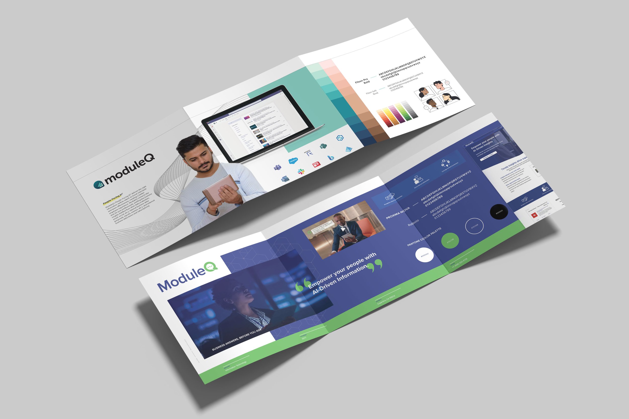
When I joined ModuleQ, it was clear they had something brilliant on their hands – an AI insights engine designed to perfectly prep customer-facing B2B teams for any conversation. Think of it as a super-smart personal assistant, sifting through endless info to deliver exactly what you need, right when you need it. Up until 2020, their genius was broadly focused on customer-facing professionals. But in 2021, my mission was crystal clear: rebrand ModuleQ to focus on financial service professionals and speak to a targeted total addressable market (TAM). This wasn't just a logo swap; it was an in-depth, full rebrand that involved a significant shift in strategic approach.
As the creative director and designer on this exciting rebranding project, I dove headfirst into shaping ModuleQ's new identity. Working with the team, we meticulously crafted guidelines around everything: language (voice) to ensure we sounded just right, logo usage, photography, colors, typography, iconography, and a tidy grid system. Once our brand bible was complete, I made sure it didn't just collect dust. I rolled out a company-wide training course, empowering everyone to understand and use our new brand effectively.

Hitachi Solutions Brand Guide
Mission: Orchestrated a complete brand evolution for Hitachi Solutions post-acquisition to unify global presence.
Impact: Defined and launched a consistent, scalable brand identity across all touchpoints while maintaining the parent brand guidelines from Hitachi.
When Hitachi Solutions acquired Capax Global, it wasn't just about integrating two companies; it was about evolving a global brand to reflect a much broader, more powerful entity. My mission was to orchestrate a holistic brand evolution – defining, educating, and implementing a consistent identity that would seamlessly unify our diverse global presence. This went far beyond just logos; it was about ensuring every piece of communication, every visual cue, and every spoken word resonated with our new, expanded vision.
As the Director of Brand and Marketing Strategy, I was at the very heart of this transformation. I led the strategic integration, providing creative direction and overseeing the meticulous implementation of our new global brand. This meant diving deep into developing a comprehensive brand system that covered everything from refined language (voice) to precise logo usage, photography guidelines, color palettes, typography, and iconography. Once this robust system was in place, I championed its adoption through company-wide training initiatives. The goal was to empower every team member to become a brand ambassador, ensuring our evolved identity was consistently and effectively expressed across all global markets and solution offerings. It was a complex, rewarding journey to bring a unified brand vision to life!

Capax Global Branding
Mission: Developed and implemented a consistent brand identity for Capax.
Impact: Established clear brand guidelines for language, visuals, and overall use.
When Capax was ready for a brand refresh, I was thrilled to jump in! My mission was to develop, educate, and implement a consistent brand identity, ensuring everything from their shiny new logo to how they used images and spoke to their audience was perfectly aligned. Think of it as creating a complete personality profile for the company.
As the creative director, I spearheaded the rebranding project. Working closely with the design and marketing team, I immersed myself in building and managing their new branding system. This included meticulously crafting guidelines for language (voice), logo usage, photography, colors, typography, iconography, and a smart grid system. Once this comprehensive system was locked down (and looked fabulous, if I do say so myself!), I didn't just hand it over. Nope, I launched a company-wide training course. It was all about empowering every team member to understand and effectively use the new brand, transforming them into brand ambassadors!

Paylocity Brand Building
Mission: Initiated and developed a comprehensive brand guide for Paylocity from scratch.
Impact: Established clear brand consistency across all touchpoints and empowered internal teams to use it.
When I stepped into the world of Paylocity, I quickly noticed something vital was missing: a clear, consistent brand guide. So, being the proactive problem-solver I am, I took it upon myself to embark on a solo mission to create one! My goal was to develop, educate, and implement a consistent brand identity from the ground up, making sure every visual and verbal touchpoint resonated with who Paylocity truly is.
As the creative director on this rebranding adventure, I basically became a brand whisperer. I meticulously built a comprehensive branding system, laying out clear guidelines for everything from our voice (what we sound like when we talk to the world) to logo usage, photography styles, color palettes, typography, iconography, and even a nifty grid system. And here's the fun part: once the brand guide was complete, I partnered with Learning and Development to roll out a company-wide training course. This wasn't just any old presentation; I personally wrote, illustrated, and developed the entire training material. It was incredibly rewarding to see the team embrace our new brand identity and truly understand how to wield its power effectively.