Boeing
Boeing Frontiers redesign
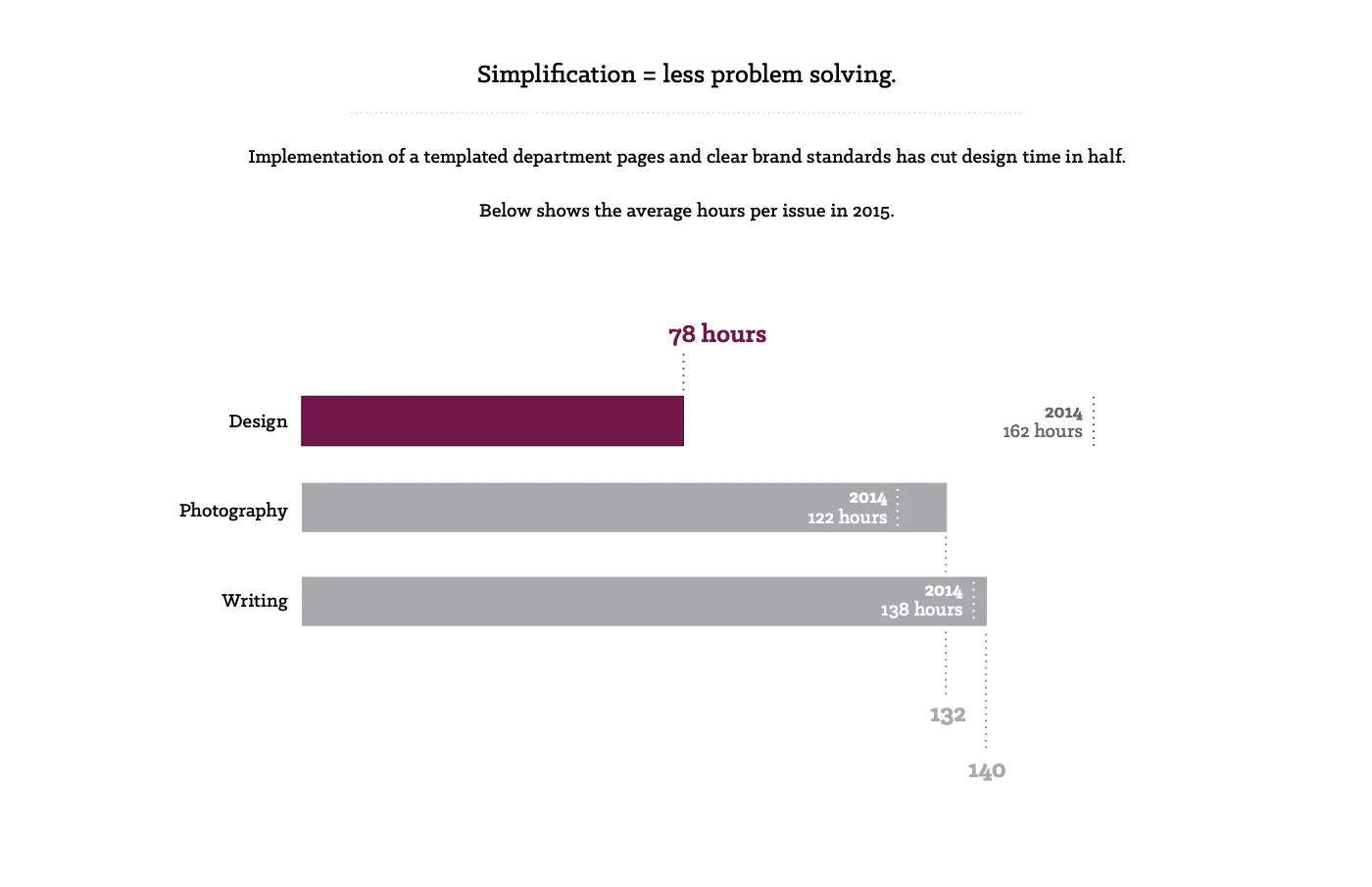
Halved design time per issue, from 162 hours to 78, with templated department pages and clear brand standards.
Boeing's employee magazine, 75,000 printed copies a month. I cut its design time in half and put the time back into the covers and features.
- Role
- Art Director
- Company
- Boeing
- When
- 2013 to 2016
The magazine
Frontiers was Boeing's magazine for and about its employees. Eleven issues a year, 75,000 printed copies each. Online, more than 500,000 page views a month. It had to speak to everyone from the factory floor to executives.
The problem
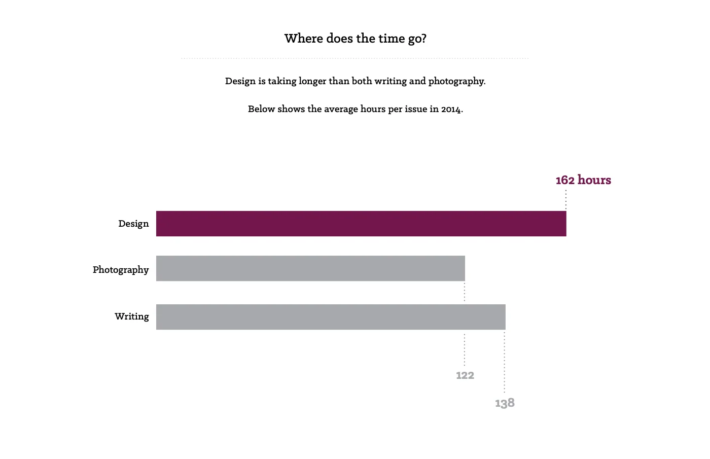
Design took longer than anything else in an issue. In 2014 it took 162 hours an issue, more than writing (138) or photography (122). Once a story had a clean draft, the design team had two weeks to lay it out and start the approvals.
Design ran up against print deadlines every month. Hours went into rebuilding recurring pages instead of the covers and features. Department pages looked different from one issue to the next, so readers had a harder time finding their way.
Department templates
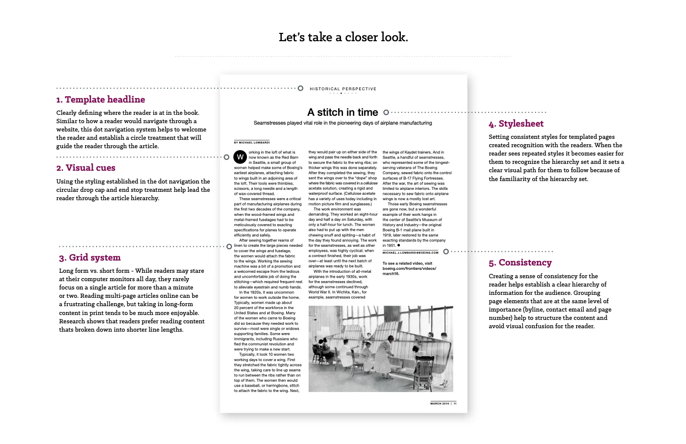
Department pages run in almost every issue, so I started there. Making them consistent would speed up design and make them easier to read. I templated them and set clear brand standards:
- A dot navigation that tells readers where they are in the book
- Circular drop caps and end stops that lead them through an article
- A grid with shorter line lengths, which readers prefer for long reads
Templates risked making every issue feel the same, so I kept covers and features custom. The refresh also needed buy-in at the top. I presented the design rationale all the way up to the executive level before anything changed.
Before and after
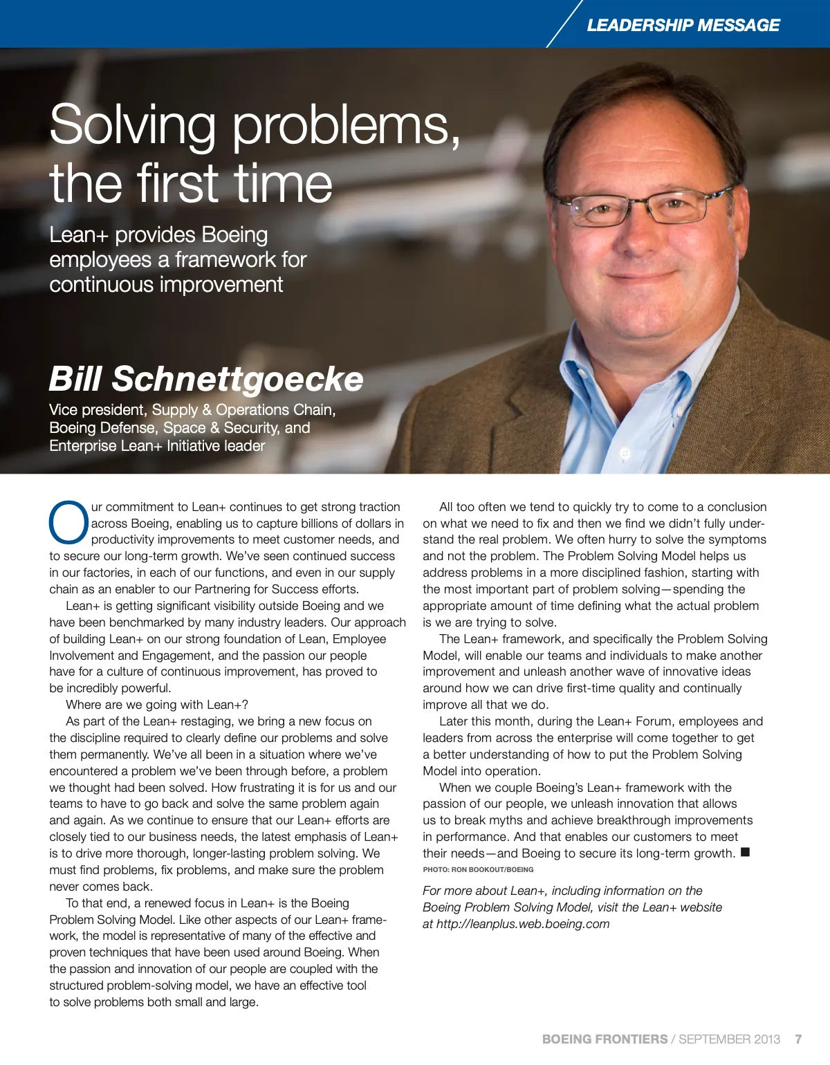
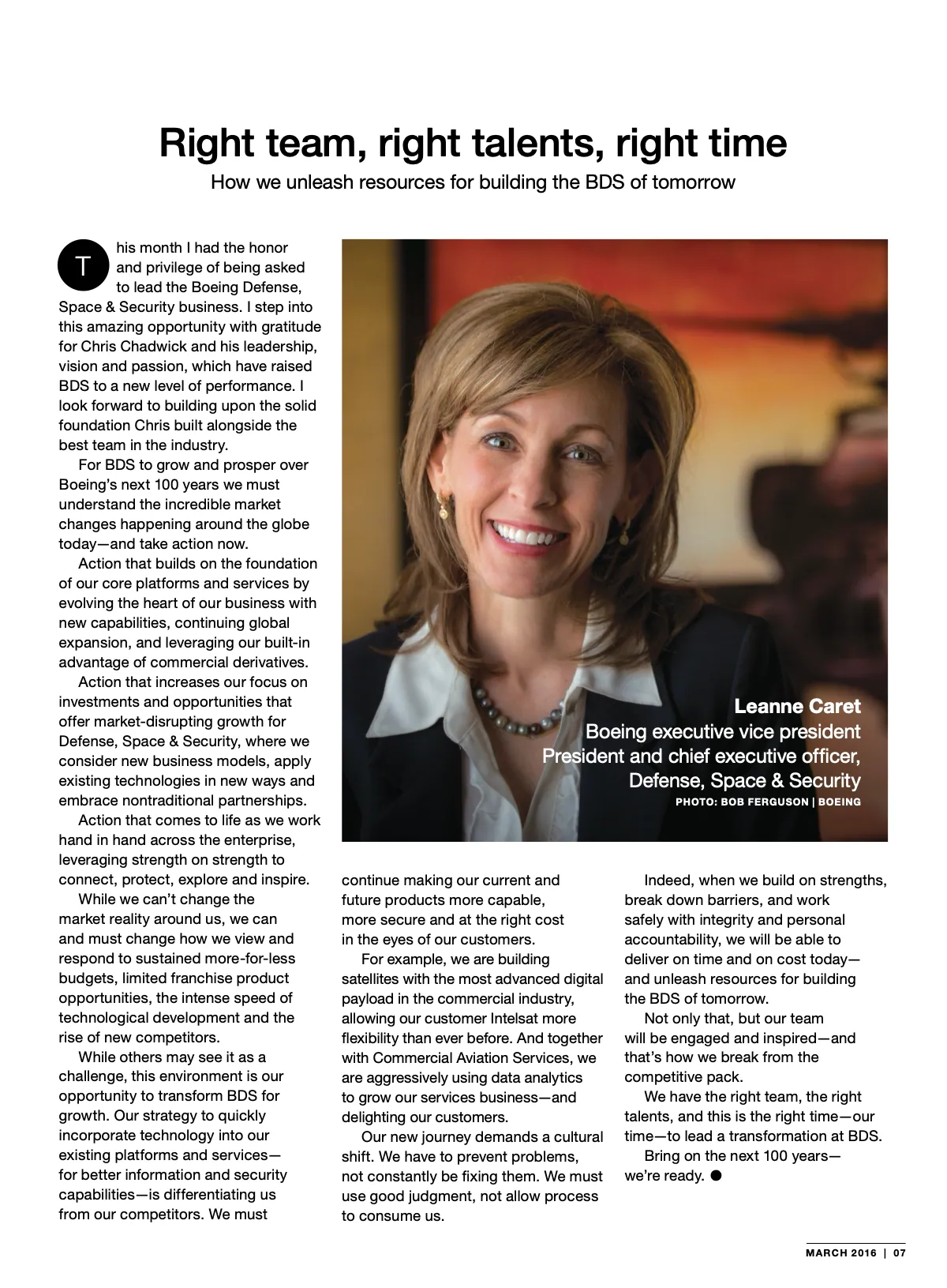
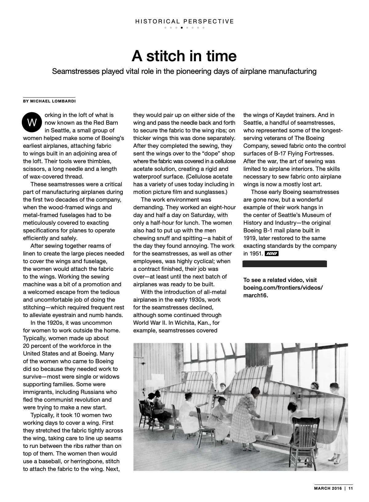
The same three departments, September 2013 against March 2016. I replaced the blue bars and blue pages of 2013 with a small label, one headline style and room for the photography.
Leadership message
Before
After
Snapshot
Before
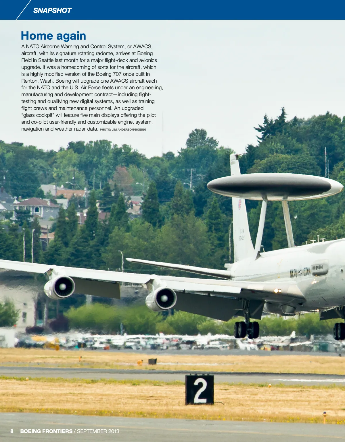
After
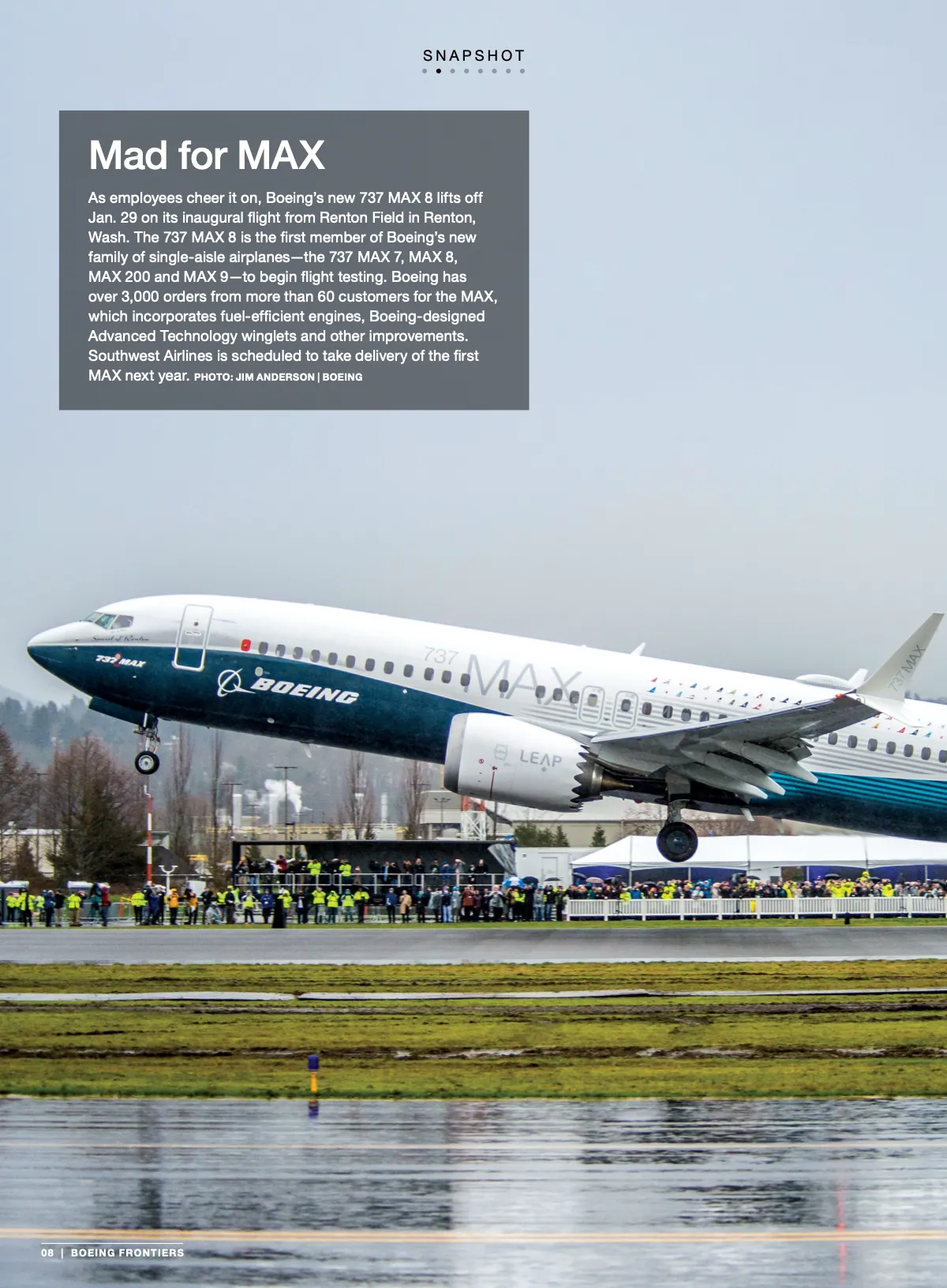
Historical perspective
Before

After
Half the time
In 2015 design took 78 hours an issue, down from 162. I put that time back into the covers and features. Consistent department pages made each issue easier to navigate. Online page views grew about 5% a month.
My role
I art directed and designed Frontiers, working with the editorial team on photo direction and layout.
Walkthrough
Full pieces
Screen 1 of 22. Click the screen or use the arrow keys to step through.
Boeing Frontiers issue with an employee portrait on the cover, beside an open spread titled Our Boeing
Keep reading
Case study
Boeing Frontiers centennial
Art directed the 100-page centennial issue, 185,000 copies, after designing the poster that started the countdown.
Case study
ModuleQ brand relaunch and Unprompted AI
Coined and trademarked Unprompted AI™ to define a new category, and designed and launched the brand identity (logo, visual system and voice) in under eight weeks, the core of the sales story.
Case study
Capax Global brand refresh
Designed and wrote Capax's first brand guidelines and trained the whole company on them. The brand helped close the deal when Hitachi Solutions acquired Capax.